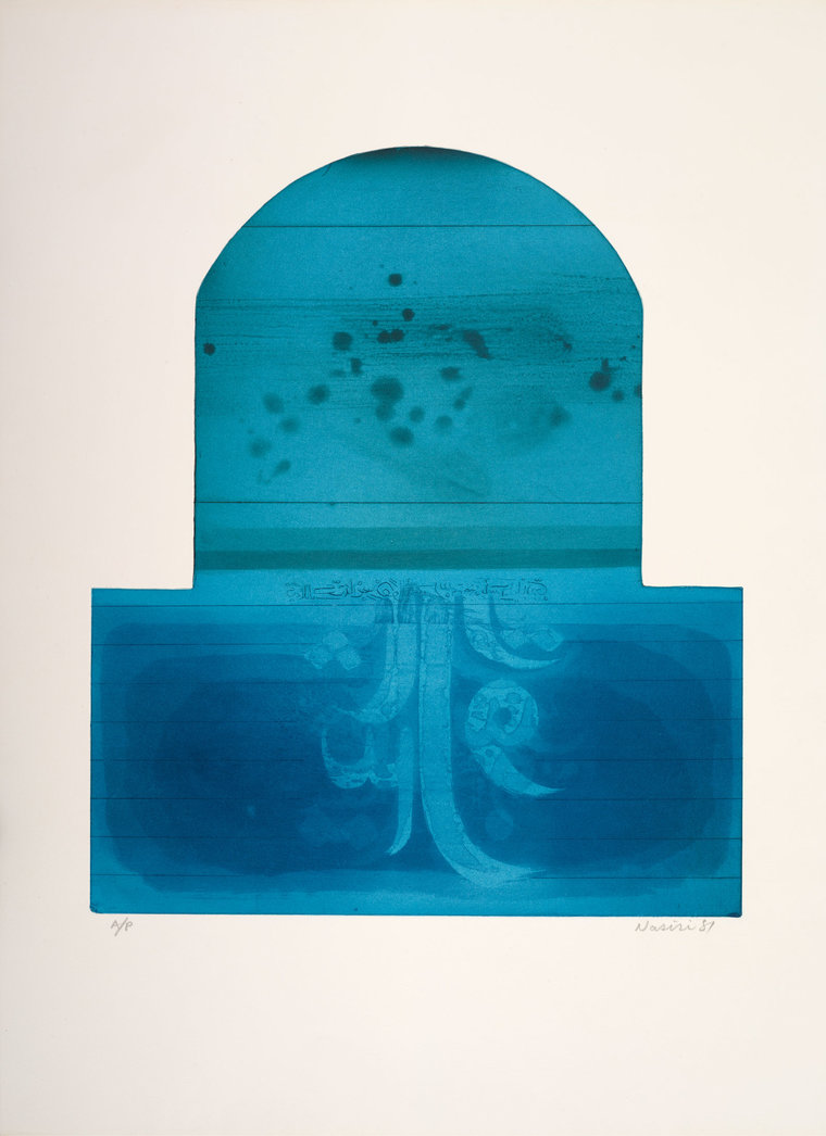
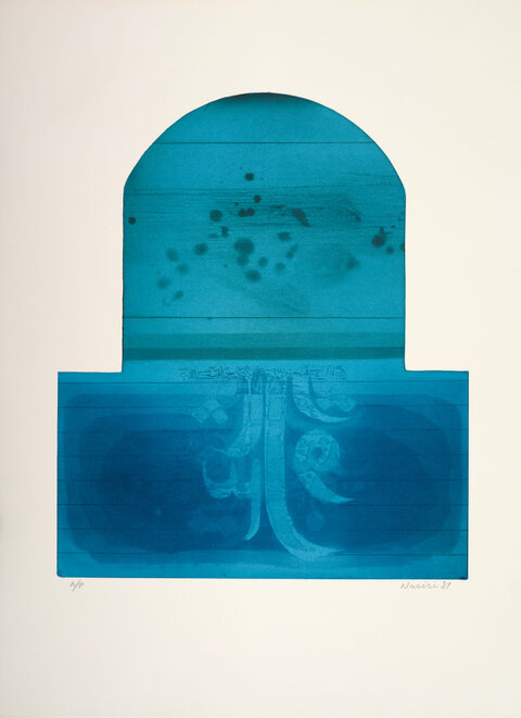
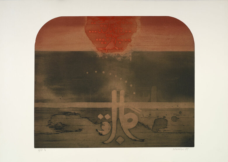
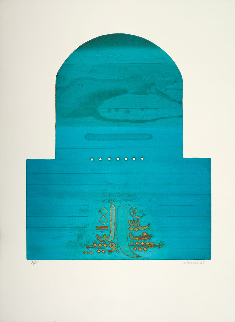
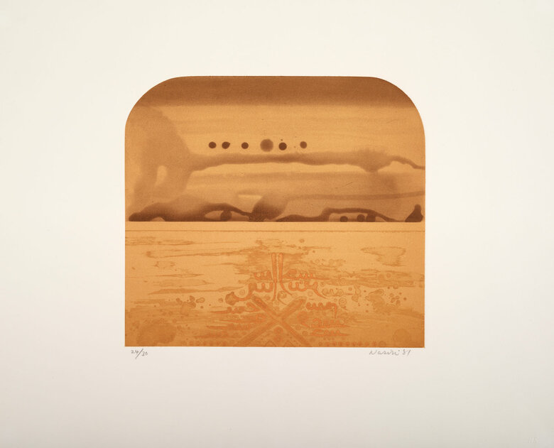
Untitled, 1981, part of Rafa Nasiri’s Variation on the Horizon series, highlights the evolution of Nasiri’s journey with printmaking in terms of medium, style, and theme. In this print, Nasiri merges Chinese and Iraqi references by dividing the composition into two parts: a turquoise rectangular base and a turquoise semicircular arch above, achieved by cutting into the metal etching plate. These geometric shapes are significant in Chinese cosmography (referred to as Gia Tian), where circles represent heaven – denoting oneness and perfection – and squares represent earth – reflecting human limitations. The work integrates these symbols with the shape of an arched Iraqi window, overlooking a distant horizon between earth and heaven. The division creates the duality of a cosmic world where “ethereal transparency intertwines with earthly solidity”.
In this print, the rounded turquoise arch above the horizon unfolds showing hazy abstracted shapes - resulting from ink stains, curling and stretching. On a plate etched to create a topography of varying depths, viscosity printing involves adjusting the thickness of inks with linseed oil and applying them at different stages. The process includes multiple inking stages: applying high-viscosity ink first, followed by low-viscosity ink on high points, and medium-viscosity ink on intermediate areas. This method ensures that each ink layer does not mix with the others, preserving clear separation between colors. Finally, the plate is pressed with a dampened sheet to print all the colors at once.
In contrast to the clouded abstraction above, in the lower half of the print, lines, and letters create a textured surface that builds a landmass below – representing the earth or human realm in the cosmos. Instead of depicting anything resembling a human, Nasiri presents complete and fragmented Arabic letters and two divergent arrows. These letters lack linguistic communicative value as they stand alone, yet they are expressive and symbolic of human activity in their stripped-down sensory movements and sounds.
The rhomboid dot, known as the nuqta, is more than a diacritical mark here. Through his arrangement of the nuqat (plural of dot), Nasari draws on the Sufi notion of the structuring nature of the nuqta – derived from the circle – as a divine essence, origin, and return point from which all other letters are connected. It was also seen as a standard of measurement. “A new system of proportional cursive scripts was codified during the 10th-13th century. In a proportional script, each letter’s shape is determined by a fixed number of rhombic dots”. In doing so, the nuqta signifies divine presence on earth as well as in the heavens, measuring out the extent of lines and letters in proportion.
This print combines Chinese printing influence and symbolism with Nasiri’s exploration of Islamic themes of oneness, language, and God. The remnants of letters and human symbols invite contemplation on the traces we leave behind and their relation to the divine.
Signed and dated in English lower right front.

